17 September, 2015

OPI VENICE COLLECTION - SWATCHES & REVIEW

Escape to Italy with the new Venice collection by OPI. 

The OPI Venice collection captures the essence of one of Europe's most romantic ancient capitals with shades to invoke the sumptuous elegance and grandiose splendour of the floating city.

The bold and elegant collection of on-trend colours consists of romantic reds, decadent blues, striking corals, dreamy pastels, elegant nudes, dramatic darks and luxurious metallics that celebrate the vision of over-the-top indulgence and to ignite and renew your passion for colour, with a touch of Italian seduction.

The OPI Venice collection brings the alluring spirit of Venice to life anywhere!

I have six shades from the collection to share with you today :)
(General consensus:  shades are all beautiful and formula's are all a dream to work with!)


 Amore at the Grand Canal  ~ 'Let this romance flow in this ravishing red' - OPI
Amore at the Grand Canal is a rich dark red nail polish shade. 

The formula of this polish is creamy and really easy to work with - It's easy to apply and effortlessly glides onto the nail, it isn't streaky or patchy and it self-levels really well - it's perfection in a bottle!

This polish is completely opaque in one coat - wow!
It also doesn't look brown on your nails like a lot of really dark red polishes tend to.


 A Great Opera-tunity  ~ '"Aria" ready to wear this gorgeous melon?' - OPI
A Great Opera-tunity is a unique dusty-pastel cantaloupe melon / light terracotta nail polish shade. 

The formula of this polish is super creamy and really easy to work with - It's easy to apply and effortlessly glides onto the nail, it isn't streaky or patchy and it self-levels really well.

This polish is completely opaque in one - two thin coats.


 Purple Palazzo Pants  ~ 'I've searched far and wide for this lovely Lilac' - OPI
Purple Palazzo Pants is a beautiful dusty-pastel pink-based purple nail polish shade. 

The formula of this polish is creamy and really easy to work with - It's easy to apply and effortlessly glides onto the nail, it isn't streaky or patchy and it self-levels really well.

This polish is completely opaque in two thin coats.
The general formula of this polish is a little thinner compared to the rest in this collection, so the second coat really helps deepen the colour and make it look more vibrant. 


 Tiramisu for Two  ~ 'I totally "dessert" this sweet coffee cream' - OPI     
Tiramisu for Two is a creamy light pink-based nude nail polish shade. 

The formula of this polish is super creamy and really easy to work with - It's easy to apply and effortlessly glides onto the nail, it isn't streaky or patchy and it self-levels really well - it's perfection in a bottle!

This polish is completely opaque in one - two thin coats which is awesome especially for the nature of the colour - I have never used a nude that's this opaque!  Simply: WOW!


 Worth a Pretty Penne  ~ 'Flaunt your fashion "cents" in this shimmery copper" - OPI
Worth a Pretty Penne is a stunning copper penny nail polish shade with some delicate sliver shimmer running throughout it.

The formula of this polish is amazing for a metallic and easy to work with - It's easy to apply and effortlessly glides onto the nail, it isn't streaky or patchy and it self-levels really well - it's perfection in a bottle!

This polish is completely opaque in one coat! Amazing!!


 Gimme a Lido Kiss  ~ 'Pucker up for this saucy red shimmer' - OPI
Gimme a Lido Kiss is a bright red metallic nail polish shade with some iridescent shimmer running throughout it. 

The formula of this polish is really easy to work with - It's easy to apply and effortlessly glides onto the nail, it isn't streaky or patchy and it self-levels really well.

This polish is completely opaque in one - two thin coats. It is technically completely opaque in only one coat, but the second coat really helps brighten and intensify the colour.

* * * 

Overall I really quite like these polishes. The colour range in this collection is simply stunning and the formulas are seriously perfection in a bottle! 

I have always wanted to travel to Venice and now with this true Venice colour palette and pun-ny nail polish names it literally puts Venice at (or on) my fingertips...so it's kind of the same thing ;)

There isn't any particular polish in this collection I wouldn't recommend, but my personal favourites and picks from this collection are "Purple Palazzo Pants", "Worth a Pretty Penne" and "Tiramisu for Two".

I definitely recommend checking this collection out for yourself - you will not be disappointed!

I cannot wait to get my hands on the rest of the collection!!


 *  *  *

RRP: $19.95 each (AUD)

Available from August 2015 at selected Myer and David Jones stores and selected Salons nationally (Australia). 
For details on retail stockists please call 1800 812 663
For details on salon enquiries please call 1800 358 999

*  *  *
*Disclaimer: CotyPR Australia kindly sent me these products for an honest review. All opinions expressed in this Blog post are mine based on what I have experienced through trialling these products.

Thanks for taking the time to read this
Have a great day 
Doni xxx


Follow me on Instagram for more swatch pics & nail art - @donsnailobsession

08 July, 2015

OPI BRIGHTS COLLECTION 2015 - SWATCHES & REVIEW

Light up your nail look with OPI's new 2015 summer Brights Collection.

The collection consists of "shockingly saturated hot pinks, to bold electric blues, to intensely vibrant red - the collection delivers rich, true-to-bottle colour in just a few coats."

These bold hues are the perfect way to make an impact - with the new Brights Collection, OPI makes it easy to create an intense colour statement without saying a word!


Although it's currently winter here in Australia, who says you can't wear colour? 

Today I have a review on seven polishes from this collection to share with you!


I STOP for Red  "This Red is so hot, it's got to be illegal!" - OPI
I STOP for Red is a 'scorching hot', bright orange-toned red nail polish colour - it's virtually the same bright red colour as a fire engine / STOP sign ;)
Nothing too unique about the colour per se but this polish does not have a straight up cream formula; it's more of a jelly-like (kind of see-through), polish and looks squishy (but not in a bad way), making it quite unique - I have nothing like it in my growing nail polish collection and I personally think the fact that it's jelly-like makes it pretty cool and more than just "another red polish".

~ I think this polish would be great to use for a 'jelly sandwich' mani or 'pond' mani - Google it!

This polish has a great formula and is really easy to work with - It's easy to apply and effortlessly glides onto the nail, it isn't streaky or patchy and it self-levels really well. 
The formula is a little runny though and I recommend being careful with your application to avoid pooling on the side of the nail.

This polish is really easy to build up, with multiple coats, to brighten and intensify the colour. The polish is completely opaque (meaning you see no visible nail line) in two - three thin coats.
*note: the whiter your nail line, the more coats of polish you'll need to apply to reach full colour opacity with no visible nail line.


The Berry Thought of You  "I think, therefore I wear this delicious Berry." - OPI
The Berry Thought of You is a delectable berry pink-toned purple nail polish colour. I absolutely love this shade and would seriously be content to wear this all the time! The colour is amazing!

The formula of this polish is very similar to I STOP for Red, with a jelly-like formula. 
It's really easy to work with - It's easy to apply and effortlessly glides onto the nail, it isn't streaky or patchy and it self-levels really well - it's perfection in a bottle!

This polish is really easy to build up, with multiple coats, to brighten and intensify the colour. The polish is completely opaque (meaning you see no visible nail line) in two - three thin coats.
*note: the whiter your nail line, the more coats of polish you'll need to apply to reach full colour opacity with no visible nail line.


My Car has Navy-gation  "I would re-route my whole day for this gorgeous navy blue!" - OPI
My Car has Navy-gation is a 'bright' deep navy blue nail polish colour.
This blue is super rich and intense.
It's deep colour intensity made it so hard to capture in a photo - It's amazing how such a dark colour can be bright at the same time. 

The formula of this polish is a little tricky to work with - it is a tad thicker then the other polishes in this collection but is also jelly-like. It is a little gloopy, sticky and patchy with the first coat of polish. - however this doesn't affect the polish's drying time.
*Once the second coat of polish is applied it is no longer patchy and self-levels really well - the polish application corrects itself with the second coat of polish, showing off the polish's true beauty and perfection.
I found that this polish is also amazingly shiny (without topcoat) compared to the other polishes in this collection. 

The polish is completely opaque (meaning you see no visible nail line) in two thin coats.


#An alternative to this polish is OPI's Eurso Euro which is virtually the same colour and the closest dupe for My Car has Navy-gation that I am aware of. 
I have both polishes and they don't look too different in the bottle, but I believe My Car has Navy-gation is a little bit of a "brighter" navy blue, but Eurso Euro has a better formula (it's a perfect one coater!).
Either way, they are both gorgeous rich and intense blue's and I love them both.


I Sea You Wear OPI  "Look who's loving waves of shimmering metallic blue." - OPI
I sea You Wear OPI is a shimmery iridescent metallic blue nail polish colour, with glass-fleck glitter and a purple flash and shift in colour depending on how you look at it.
This polish legitimately looks like the actual sea, with it's different flashes of blue.
My swatch really doesn't do this polish justice - I blame winter lighting (I use natural lighting for my swatch pics)

At first glance I didn't really think much of the polish, but when I put it on I was in awe! 
The polish is STUNNING and so unique. I am genuinely OBSESSED with it!
I definitely recommend this polish!


This polish has a good formula and is really easy to work with - It's easy to apply and effortlessly glides onto the nail, it isn't streaky or patchy and it self-levels really well.

The polish is very sheer but it's good formula allows for it to be easily built up, with multiple coats of polish, to brighten and intensify the colour. 
The polish is completely opaque (meaning you see no visible nail line) in three - four thin coats.
*note: the whiter your nail line, the more coats of polish you'll need to apply to reach full colour opacity with no visible nail line.


Can't Hear Myself Pink!  "No, I can't turn down this shimmery, metallic pink." - OPI
Can't Hear Myself Pink! is a shimmery iridescent metallic pink coral nail polish colour, with glass-fleck glitter and a gold flash and shift in colour depending on how you look at it.
It's a super unique polish.
In direct sunlight the polish looks like it's glowing and kind of reminds me of Lava - I looks stunning on the nail!

The formula of this polish is very similar to I Sea You wear OPI and is really easy to work with - It's easy to apply and effortlessly glides onto the nail, it isn't streaky or patchy and it self-levels really well. 

The polish is very sheer (more sheer than I Sea You wear OPI) but it's good formula allows for it to be easily built up, with multiple coats of polish, to brighten and intensify the colour. 
The polish is completely opaque (meaning you see no visible nail line) in three - four thin coats.
*note: the whiter your nail line, the more coats of polish you'll need to apply to reach full colour opacity with no visible nail line.


Down to the Core-al  "The beauty of this brilliant coral goes beyond skin deep." - OPI 
Down to the Core-al is a neon coral nail polish colour with iridescent pink and gold shimmer, which looks different on the nail depending on how you look at it, giving it a duo-chrome look. The colour is quite unique. 

The formula of this polish is good and really easy to work with - It's easy to apply and effortlessly glides onto the nail, it isn't streaky or patchy. I noticed it didn't appear to self-level and smooth out while it was wet, but once completely dry, it looks even and smooth. 
The formula is a little runny and I recommend being careful with your application to avoid pooling on the side of the nail.

This polish is really easy to build up, with multiple coats, to brighten and intensify the colour. 
This polish may benefit from a white base coat (I recommend OPI's "Put a Coat On") to intensify the colour and make it look more neon; but without it, it's completely opaque (meaning you see no visible nail line) in two - three thin coats.
*note: the whiter your nail line, the more coats of polish you'll need to apply to reach full colour opacity with no visible nail line.


Hotter than You Pink  "Just when you think pink can't get any hotter, there's this!" - OPI
Hotter than You Pink is a neon hot pink nail polish colour with iridescent blue and purple shimmer, which looks different depending on how you look at it, giving it a duo-chrome look. The colour is quite unique.

The formula of this polish is great and is really easy to work with - It's easy to apply and effortlessly glides onto the nail, it isn't streaky or patchy and self-levels really well.
The formula is a little runny and I recommend being careful with your application to avoid pooling on the side of the nail.


This polish is really easy to build up, with multiple coats, to brighten and intensify the colour. 
This polish may benefit from a white base coat (I recommend OPI's "Put a Coat On") to intensify the colour and make it look more neon; but without it, it's completely opaque (meaning you see no visible nail line) in two - three thin coats.
*note: the whiter your nail line, the more coats of polish you'll need to apply to reach full colour opacity with no visible nail line.


* Put A Coat On!  
Put a Coat on is pretty much just a white basecoat to apply to the nail to brighten the nail polish you put under it - you can literally amp up any bright shade with this colour boosting basecoat ~ I also think it would also be a great basecoat for ombre / gradient nail art. 

I really like the idea of this basecoat and can see myself getting a lot of use out of it!


(I will hopefully have a separate review of this basecoat up on my blog soon, showing the colour intensity this basecoat creates when applied under neons - I will attach a link here when I do - watch this space!)


* * * 


Overall I quite like these polishes. The colour range is a little disappointing compared to previous "Brights" collections but the polishes are still really pretty and colour intense, and will definitely make a statement.

There isn't any particular polish in this collection I wouldn't recommend, but my personal favourites and picks from this collection are "The Berry Thought of You", "I Sea You Wear OPi" and "Can't Hear Myself pink". 


Don't be deceived when applying the first coat of polish - all of the polishes in this collection are on the sheer side and need at least two coats of polish before they looks opaque and resemble the colour in the bottle. 
*Remember: The whiter your nail line, the more coats you'll need to apply to reach full colour opacity.

 *  *  *

RRP: $19.95 each (AUD)

Available in June 2015 at selected Myer and David Jones stores and selected Salons nationally (Australia)
For details on retail stockists please call 1800 812 663
For details on salon enquiries please call 1800 358 999

*  *  *
*Disclaimer: CotyPR Australia kindly sent me these products for an honest review. All opinions expressed in this Blog post are mine based on what I have experienced through trialling these products.

Thanks for taking the time to read this
Have a great day 
Doni xxx


Follow me on Instagram for more swatch pics & nail art - @donsnailobsession

11 May, 2015

OPI SOFT SHADES COLLECTION 2015 - SWATCHES & REVIEW

Nail the nude look with OPI's new 2015 Soft Shades collection.
OPI bring the richly pigmented formulas you love to the season’s hottest nude nail trends, 

“Soft Shades nail lacquers make a very powerful statement by being enticingly feminine with a delicate hue”

These pastel hues are the perfect way to lighten up your spring style by adding a nice and subtle hint of colour to your nails appropriate to wear all year round. 


Today i have a review on three of the six polishes from this collection to share with you!


PUT IT IN NEUTRAL "I'm driven to get my hands on this pinkish beige" - OPI
Put it in Neutral is a delicate dusty pink toned nude nail polish shade.

This polish is not a straight up cream formula, it's more of a jelly like polish and looks squishy (but not in a bad way).

This polish was really easy to work with - It's easy to apply, it wasn't streaky or patchy and it self-levelled really well. 

It is really sheer but that is the nature of the polish - It's supposed to have a sheer finish.
The formula of this polish is really sheer but is not too thin, which makes it easy to build up to opacity with enough coats of polish. Building up the colour with multiple coats was not an issue in terms of pooling on the side of your nails and dry time. I found that it actually dried relatively quickly in between layers and your nails don't look too thick with nail polish. It's a very flattering polish on the nail.  

This kind of polish is supposed to be worn with about two coats of polish for a natural look where you can still see visible nail line. 
I am personally not a huge fan of this look and prefer it to be relatively opaque, so i found that about four coats gets it to look opaque enough for my liking. With four coats of polish you can really see the true beauty and colour of the polish - it's so beautiful. 


THIS SILVER'S MINE!  "I totally dig this pearly silver" - OPI
This Silver's Mine! is a very unique rose gold toned silver / champagne nail polish shade with a pearly frost like finish. It's a gorgeous shiny eye-catching colour.

The formula of this polish is perfect. It's easy to apply, it wasn't patchy and it self-levelled really well. It is quite opaque in one coat but needs two thin coats of polish to reach full opacity. 

This polish, like most typical metallic nail polishes, leaves noticeable brush strokes with each nail polish swipe on the nail. Adding topcoat will not help remove the streaks. 
The strokes don't bother me too much but there are ways to eliminate the strokes / make them not as noticeable. I suggest:
  • Sponging the second coat of polish onto the nail with a makeup sponge
  • Using a matte topcoat directly over the first coat of polish and apply a second coat of the polish directly over the topcoat - this is the method i used in my swatch and found it worked pretty well.
Streaky or not i am in love with this polish!


ACT YOUR BEIGE!  "Age is just a number, but this light beige is #1"  - OPI
Act Your Beige! is a pink toned beige nail polish shade.

It's formula is very similar to 'Put it in Neutral' but it's a little more sheer.
It's not a straight up cream formula, rather it's more of a jelly like polish and looks squishy (but not in a bad way).

This polish was easy to work with - easy to apply, it wasn't streaky or patchy and it self-levelled really well.

It is really sheer but that is the nature of the polish - It's supposed to have a sheer finish.
Although this polish is sheer it's not too thin, which makes it easy to build up to opacity with enough coats of polish. Building up the colour with multiple coats was not an issue in terms of pooling on the side of your nails and dry time. I found that it actually dried relatively quickly in between layers and your nails don't look too thick with nail polish. It's a very flattering polish on the nail.  

This kind of polish is supposed to be worn with about two coats of polish for a natural look where you can still see visible nail line. 
I am personally not a huge fan of this look and prefer it to be relatively opaque, so i found between four - five coats gets it to look opaque enough for my liking. With five coats of polish you can really see the true beauty and colour of the polish - it's so beautiful. 


*  *  *

I'm totally digging these polishes.I don't usually gravitate towards these kind of colours but i am obsessed with these.There is just something different and delicate about these shades. 
I would actually be quite content to wear these weeks on end.

Definitely recommend picking up all three of these shades! 


*  *  *
RRP: $19.95 each (AUD)

Available in April 2015 at selected Myer and David Jones stores and selected Salons nationally (Australia)
For details on retail stockists please call 1800 812 663
For details on salon enquiries please call 1800 358 999

*  *  *
*Disclaimer: CotyPR Australia kindly sent me these products for an honest review. All opinions expressed in this blog post are mine based on what i have experienced through trialling these products.

Thanks for taking the time to read this
Have a great day 
Doni xxx


Find me on:
Instagram ~ @donsnailobsession
Twitter ~ @donsnails

22 April, 2015

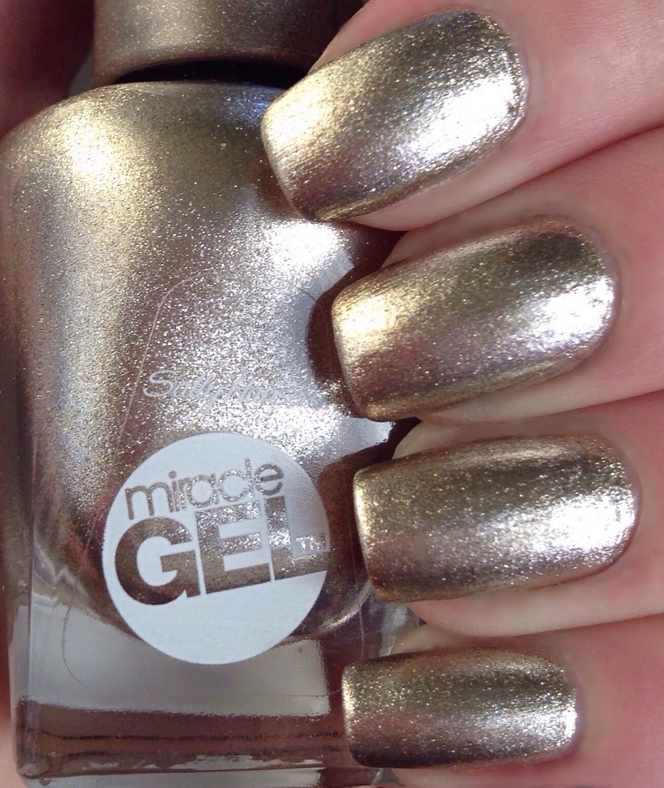
SALLY HANSEN MIRACLE GEL "GAME OF CHROMES" NAIL COLOUR - SWATCH & REVIEW

Get salon quality nails in two easy steps with Sally Hansen's Miracle Gel  nail polish.

Miracle Gel is a revolution in gel technology, with it's part-lacquer, part-gel formula. 

Get the lasting results of a gel manicure without the hassle. Miracle Gel polish promises up to 14 days of Colour and Shine - delivering a high shine, glossy look just like a salon quality manicure.  


Miracle Gel is a two-step gel manicure that does not need to be cured by UV / LED light - so its less damaging to the nail. It applies just like regular nail polish.

How to use ~
STEP 1: Apply two coats of the Miracle Gel nail colour of your choice. No basecoat needed.
STEP 2: Activate curing of the polish with one coat of the Miracle Gel Topcoat.


Sally Hansen Miracle Gel polishes have the same amazing wide brush just like Sally Hansen's Complete Salon Manicure range; making application of the three-stroke method a breeze.


Sally Hansen Australia have just released five new shades including US best sellers.

Today i have a  review on US best seller 'Game of Chromes' to share with you.

GAME OF CHROMES
Game of Chromes is a GORGEOUS metallic gold foil polish. It seriously looks like you've dipped your nails in liquid gold! Absolutely STUNNING!!
This polish appears to be made up of gold and silver shimmers - 
to me indoors, the polish looks like a definite gold colour, but in direct sunlight, you can kind of see a shimmery duo-chrome look to it, with a gold to silver kind of shift.

I've only had this polish for a couple of weeks and I've already worn it three times! That's a record for me.
I am seriously OBSESSED with this shade! 
I am drawn to anything shiny and metallic, so i knew this would be a polish i'd love!

The formula of this polish is perfect! It is slightly thicker then normal polish but it's still a dream to work with. It's nice and smooth and easy to work with - it effortlessly glides onto the nail. It's also not streaky, unlike other metallic polishes. 

It needs two coats of polish to look fully opaque. There's nice and even coverage with each coat and it self-levels really well with each coat of polish. 

The polish wears pretty well. I didn't wear the polish for 14 days to test Sally Hansen's claim but i did have it on for a full week. The polish only suffered some tip wear (which is to be expected). Other then that i had no major chips and the polish shine didn't turn dull. Really impressive. I couldn't stop looking at my nails the whole week. 


You don't need to wear a base coat before applying the polish, but i wore a coat of ridge filler just to make my ridges and imperfections not look as prominent - as metallic polishes tend to overexpose imperfections. 


To get the "Gel" look, pair the polish with the Miracle Gel Topcoat. Apply a coat of the topcoat and let natural light do the rest.
The topcoat is nice and smooth and glides right on the nail. It also doesn't smudge!
Apparently the gel topcoat cures and hardens using natural light, hence the more sunlight there is, the quicker your nails will dry. That's not to say it won't dry when its dark, it will just take a little longer. - dry time varies. I tend to paint my nails at night before bed, when there is no sunlight, and i found the polish takes the same amount of time as a standard polish to dry.
Game of Chromes alone is shiny and sparkly enough so you could probably get away without using the topcoat. But if you want to ensure long wear time you definitely need a coat of topcoat.
I personally don't think you even need this specific topcoat though. You could really use any topcoat over the polish - it just won't give your nails a  "gel"  look.


*  *  * 


I was surprised with how easy it was to remove with nail polish remover, whether it be acetone or non-acetone remover. It removes just like regular nail polish, so no soaking, wrapping or scraping is required. 
I did notice however that some silver shimmer residue remains on the nail, but it wasn't too hard to remove while washing hands.


Game of Chromes is a versatile shade great to wear all year round no matter the season and is sure to compliment any skin tone.

I am actually so impressed with Game of Chromes and cannot wait to try out some other polishes from the Miracle Gel range.

Definitely recommend getting  your hands on this polish - it's to die for!

*  *  * 
RRP: $16.95 (AUD)
(well worth the price - especially for Game of Chromes)

Find Sally Hansen polishes at these retailers: http://au.sallyhansen.com/store-locator

*  *  * 
*Disclaimer: CotyPR Australia kindly sent me these products for an honest review. All opinions expressed in this blog post are mine based on what i have experienced by trialling these products.

Thanks for taking the time to read this
Have a great day 
Doni xxx


Find me on:
Instagram ~ @donsnailobsession

Twitter ~ @donsnails